
Modernizing a Complex Professional Workflow
Lead UX/UI Designer | Research • Workflow Design • Product Strategy

01
Project Overview
The “Trace Track System” (TTS) began as an exploratory prototype designed to help investigators trace food products through complex supply chains during foodborne illness investigations.
As the sole UX/UI designer on a multidisciplinary innovation team, I evaluated the existing prototype and redesigned its core experience around investigators’ needs and workflows. My work spanned research and information architecture through interaction design, prototyping, testing, and visual design.
*All designs shown are illustrative mockups created for this case study and do not duplicate screens or sensitive information from the actual application.
Problem Statement
Food-tracing investigations involve complex information from multiple sources. The existing prototype needed a clearer, more efficient experience for organizing information, tracing products, and identifying relationships within a potential outbreak.
The Goal
Redesign the prototype around investigators’ workflows so complex tracing information is easier to navigate, interpret, and act upon.
My Role
Role: Lead UX/UI Designer and sole product designer
Scope: User research · workflow design · interaction design · wireframing · visual design · usability testing · developer collaboration
Timeline: 2022–Present
Team: Cross-functional innovation team
Project Type: Enterprise / Federal Product Innovation
02
Evaluating the Existing Experience
I joined the project after an initial prototype had already been developed by an outside team. Before redesigning it, I evaluated the existing experience to understand both its technical constraints and usability challenges.
My UX review focused on whether the interface clearly communicated its functionality, supported expected user behaviors, and made complex tracing information understandable. The review revealed issues with navigation, terminology, interaction consistency, accessibility, and information hierarchy.
Key UX Findings
While technical reviews identified functional limitations, my evaluation focused on how well the interface supported the people expected to use it.
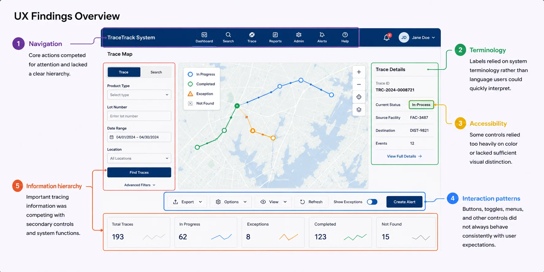
Navigation & Hierarchy
Core actions were difficult to distinguish from secondary tools and system controls.
Terminology
System-oriented labels made some actions harder to interpret without prior knowledge.
Interaction Patterns
Several controls behaved differently from familiar interface conventions, increasing uncertainty.
Accessibility
Reliance on color, inconsistent labeling, and control treatments could make information harder to distinguish and interpret.
Information Hierarchy
Important tracing information was competing with secondary controls and system functions.
These findings gave me an initial hypothesis for the redesign, but evaluating the interface alone couldn’t tell me how investigators actually approached the work. That required talking to users.
Learning From Users
I developed a UX research plan to evaluate the assumptions emerging from the prototype review and better understand investigators’ workflows, pain points, terminology, and priorities.
Because UX was new to some project participants, I also introduced the research process and helped establish how user input would inform product decisions.
7 participants interviewed • Remote • Over 2 weeks • 12 Themes • 252 Comments
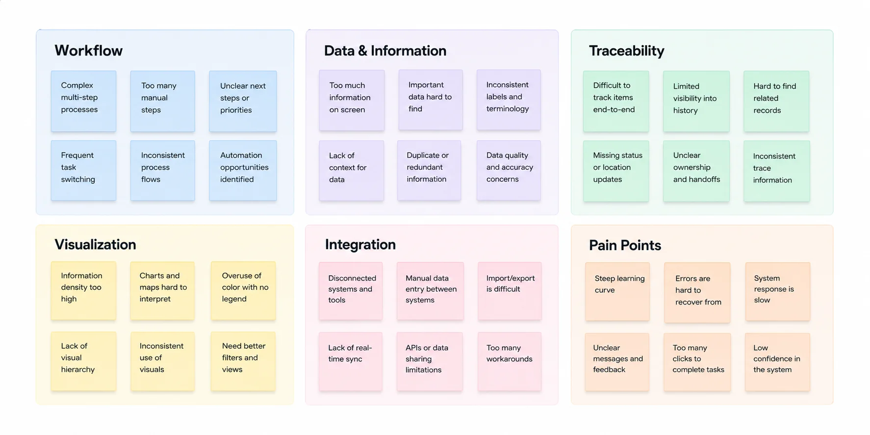
I interviewed seven participants involved in foodborne-illness investigations and captured 252 observations about their workflows, tools, frustrations, and priorities. Research revealed processes still dependent on Word, Excel, paper records, and other fragmented tools. I synthesized those findings through affinity mapping and translated them into personas, user flows, competitive research, and early interface concepts.
Key Research Insights
Fragmented tools slow investigations
Current investigation methods are outdated and manually intensive. Programs utilized do not talk to each other, user error with data input is a concern and stress point.
Complex workflows need clearer structure
Investigators worked across multiple types and sources of information, making it important for the product to establish clear relationships and reduce cognitive load.
Data integrated had to be validated and visible
The source file for data used in an investigation needed to be viewable in order to verify its integrity at any point before a final finding could be made.
Familiar patterns increased confidence
Clear terminology, predictable controls, and recognizable interaction patterns could reduce the effort required to learn and navigate the system.
From Findings to Design Priorities
The themes emerging from user research shaped the next stage of the design process.
One of the most important lessons from the original research was simply the value of asking investigators why they needed to work a certain way. Several participants described workflows that initially seemed awkward but were essential to how they performed their jobs. Those conversations shaped the initial product and continue to influence how I approach new TTS workflows today.
Clarify the Workflow
Make complex investigative processes easier to follow.
Reveal Relationships
Help users understand connections between products, locations, events, and evidence.
Reduce Cognitive Load
Organize dense information around the decisions users need to make.
03
Translating Research into the Product
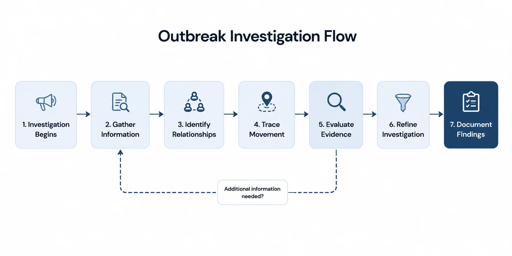
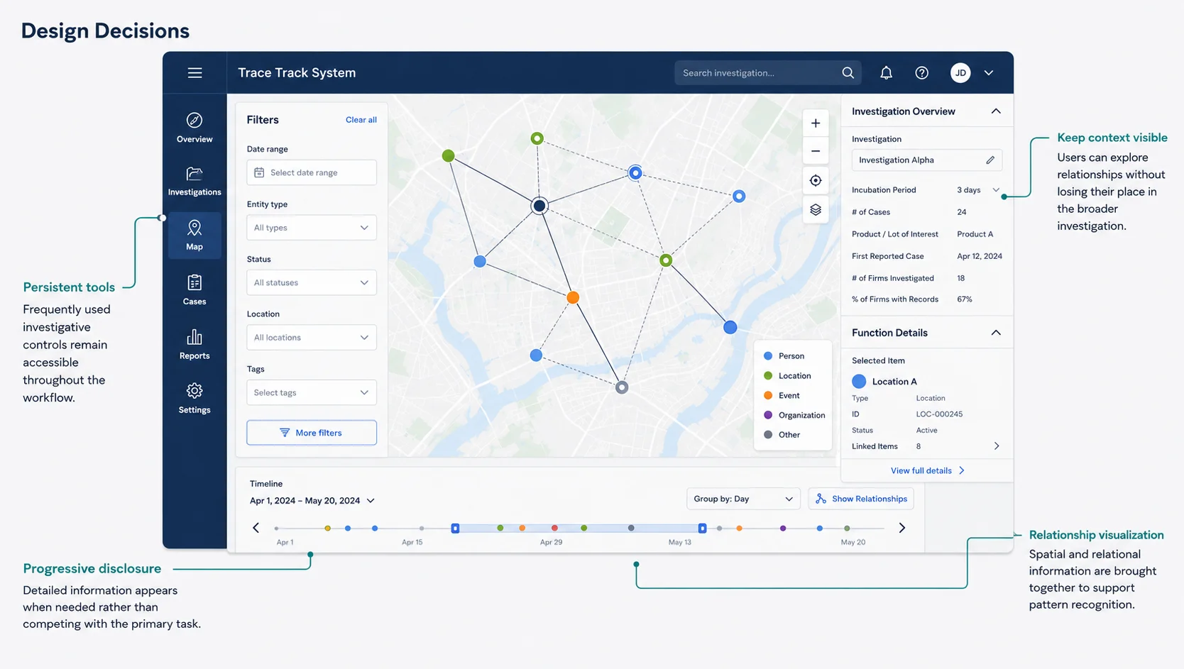
Using the information derived from the user interviews and prototype review, I began translating the findings into a product structure to support a complex, iterative investigation process.
After mapping the broader investigative workflow, I translated key tasks into screen-level flows that accounted for branching actions, system states, and the screens needed to support each path before prototyping.
Exploring the Interface
Early concepts moved from paper wireframes into low-fidelity prototypes, allowing key workflows and interaction patterns to be reviewed with stakeholders and investigators before higher-fidelity design.
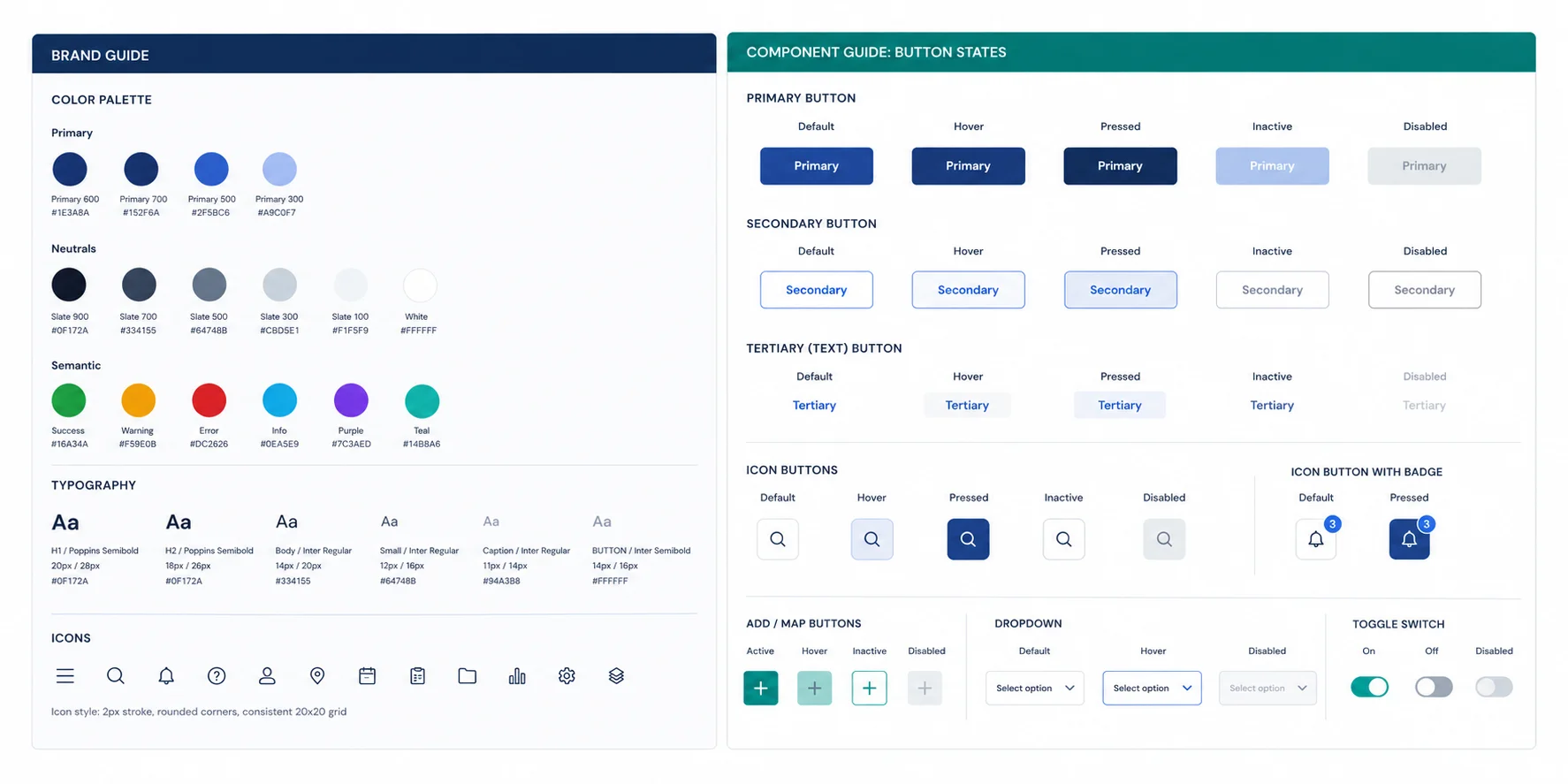
Building a Visual System
To support consistency as the product evolved, I established a visual system defining color, typography, iconography, component styles, and interaction states. This created a shared reference for design and development as new screens and functionality were added.
04
Designing the Experience
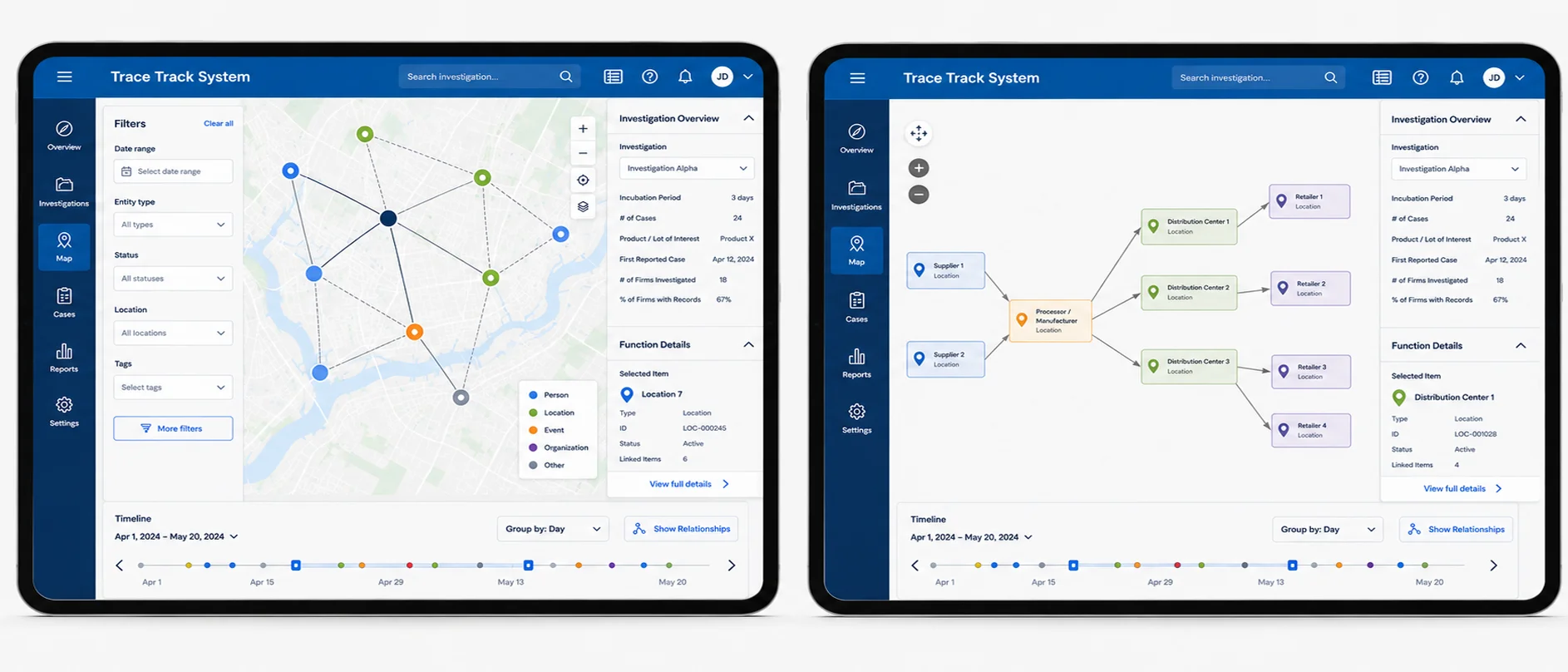
With the core workflows defined, I translated the redesigned experience into an updated working prototype in collaboration with the development team. Because the project operated within a limited development window, we prioritized improvements that would have the greatest impact on the investigation workflow and prepared the prototype for evaluation with users.
Evolving the Core Experience
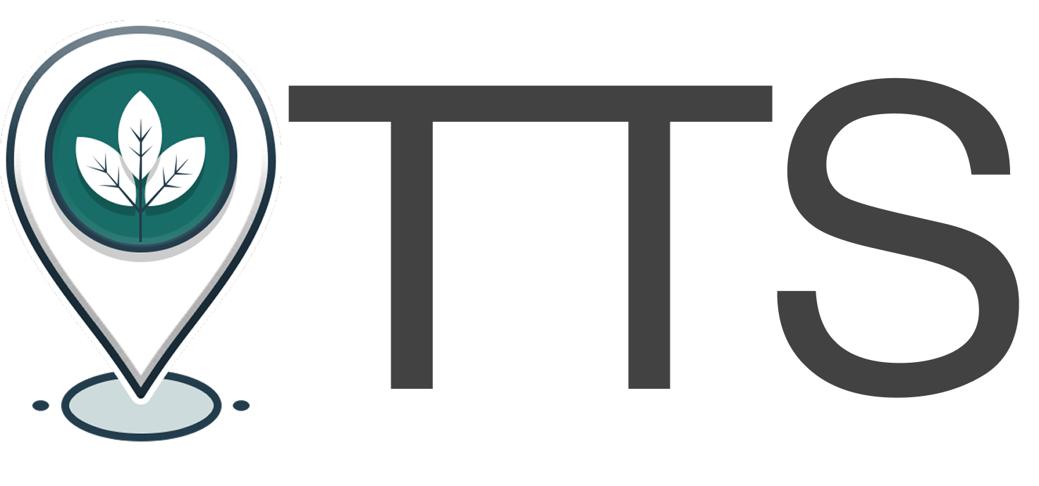
Exploring the Product Identity
I also explored visual identity concepts for the emerging product. Although these directions were ultimately retired in favor of an identity aligned with federal branding requirements, they represent an early effort to give the prototype a distinct, approachable visual presence.
05
Testing & Evolution
Testing Before UAT
Before formal User Acceptance Testing, the team worked through structured scenarios covering core workflows and documented expected outcomes for each task. Internal testing refined both the application and the UAT protocol, identifying gaps in system feedback, error handling, terminology, workflow coverage, and functionality that was not yet ready for user testing.
Findings were translated into updated test scenarios, design and development discussions, and tracked issues before the application moved into formal UAT. This created an iterative testing process rather than treating UAT as a single pass/fail milestone.
Clearer feedback
Testing exposed situations where unsuccessful actions didn’t provide users with enough information about what had happened, prompting clearer notification and error-state requirements.
Better error handling
Invalid location data revealed edge cases in automated geocoding and highlighted the need to help users recognize and recover from unresolved or erroneous information.
More complete test coverage
Internal review identified missing scenarios and inconsistencies between test instructions and the evolving interface, leading the team to refine the UAT plan before formal testing.
User Testing
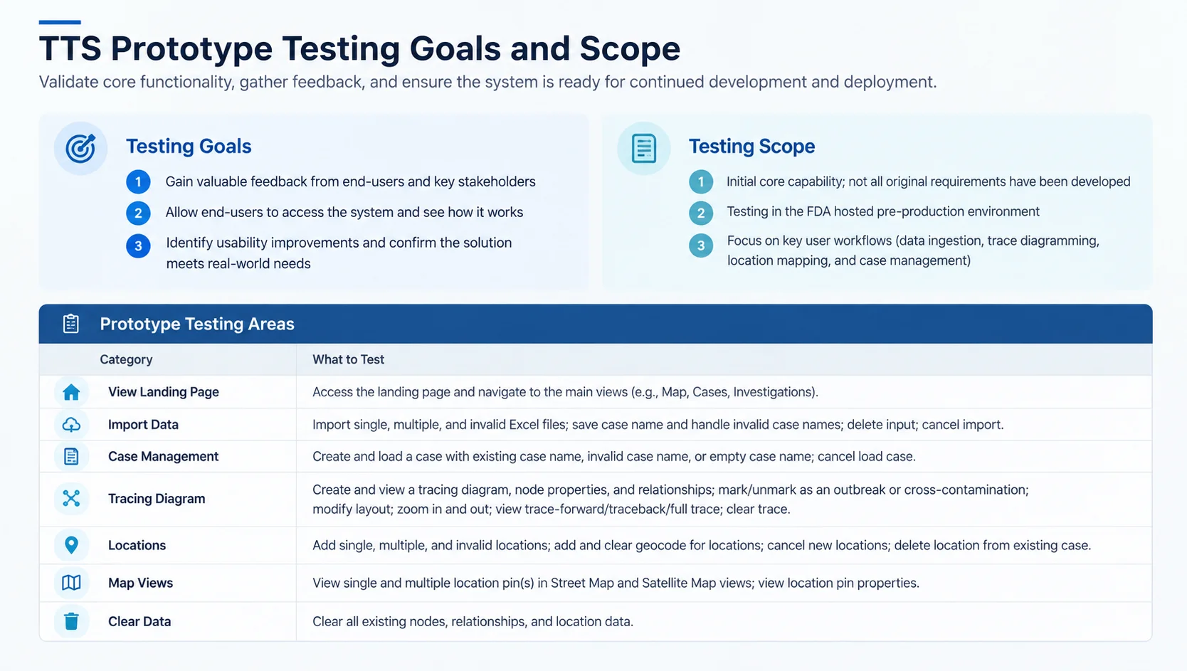
In August 2023, 15 federal users evaluated the redesigned prototype against core investigation workflows. Testing focused on whether investigators could understand the new interaction model, complete key tasks, and navigate the more complex tracing experience successfully.
15 participants · 2 weeks · Task-based testing · Federal investigators
After Testing
Testing informed another round of interface and workflow refinements. The completed prototype and research findings were then submitted for evaluation alongside other contracted solutions.
06
Impact & What’s Next
From Prototype to Production
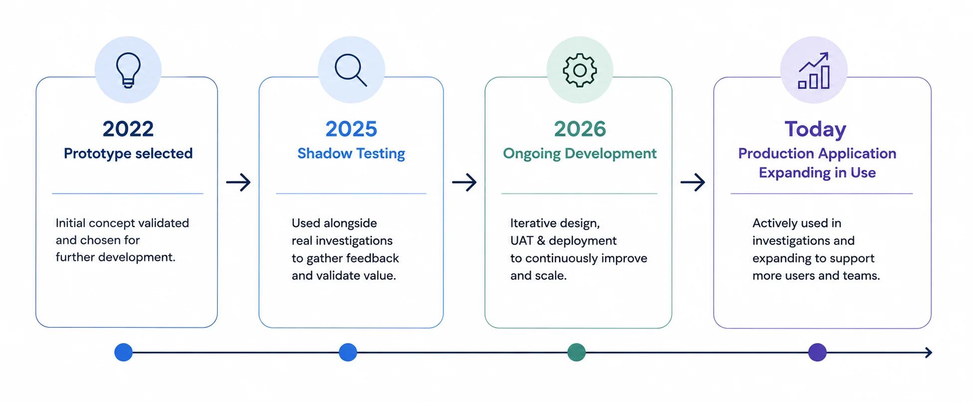
The redesigned prototype was one of several approaches commissioned for evaluation. After reviewing the competing concepts, stakeholders selected our prototype to move forward into continued development.
What began as a short innovation project became an ongoing product. The application was first used alongside real foodborne-illness investigations, allowing the team to evaluate its performance without disrupting existing workflows. Continued funding moved TTS into active development, with new capabilities designed, tested through UAT, and released through iterative sprints.
Today, TTS is being progressively deployed to additional users and taking on a larger role in outbreak investigations as the organization prepares to transition away from existing manual processes.
Design Work Continues
As the sole UX/UI designer, I continue to design new workflows and features, resolve interaction and interface questions with the development team, translate stakeholder concepts into production-ready designs, and refine the experience as TTS expands.
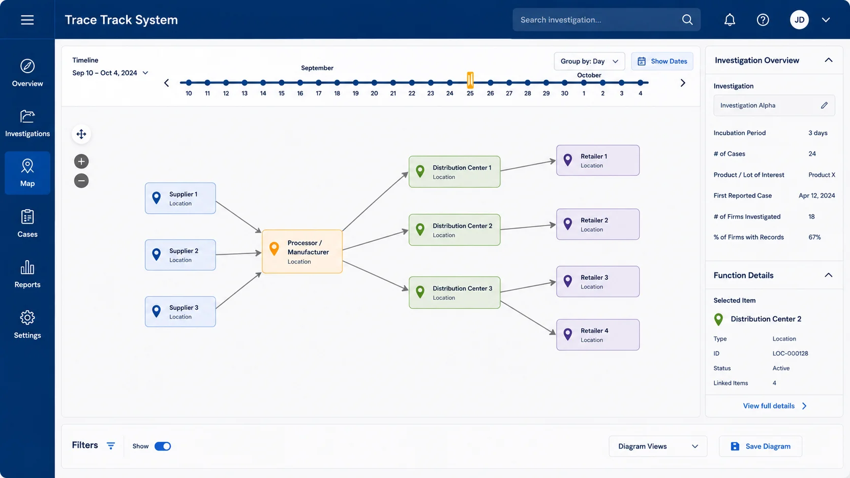
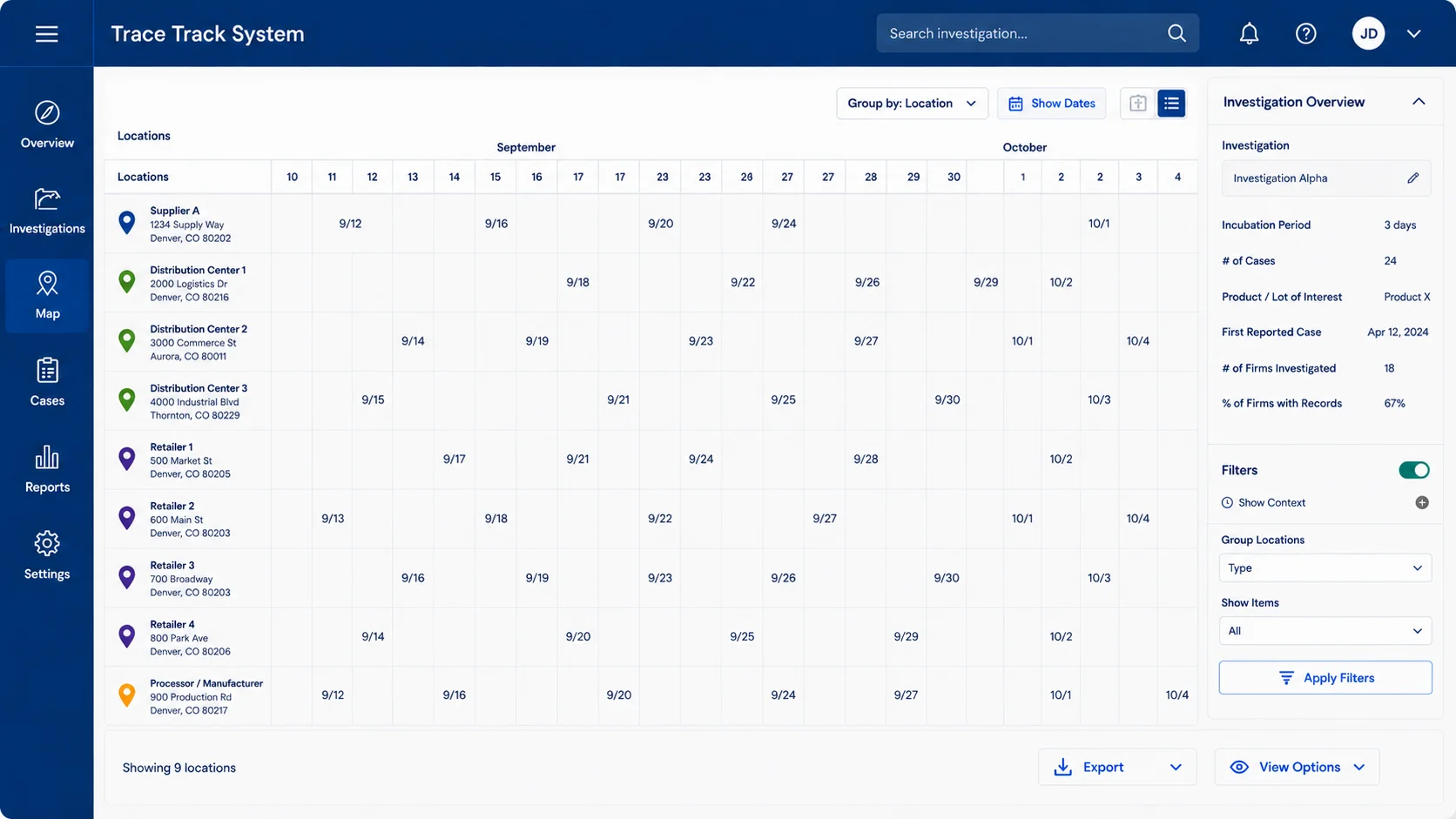
One concept originated during my initial research and workflow mapping but wasn’t feasible within the original prototype timeline. In 2026, as TTS matured, I had the opportunity to revisit it and design a new Traceback Through Time experience that transforms dense investigation data into a visual representation of events and relationships.
In Use Today
During shadow testing on a real outbreak investigation, stakeholders reported that TTS reduced the time required to identify the exposure source by more than three days.
That result captures what makes this project meaningful to me. Better investigation tools aren’t simply more efficient. Helping investigators identify the source of a foodborne illness sooner can reduce exposure, accelerate response, and help protect people.
Designing for Real-World Impact
TTS has become one of the most meaningful projects of my career. What began as a short prototype challenge has grown into an operational product I continue to help shape years later.
The work reinforced something I first heard during the original research: meaningful UX begins by understanding how people actually need to do their jobs. In a system supporting foodborne-illness investigations, making complex information easier to understand isn’t simply a usability improvement. Faster, clearer investigations can help agencies respond sooner and protect public health.
That’s the impact I’m proudest of.