


01
Project Overview
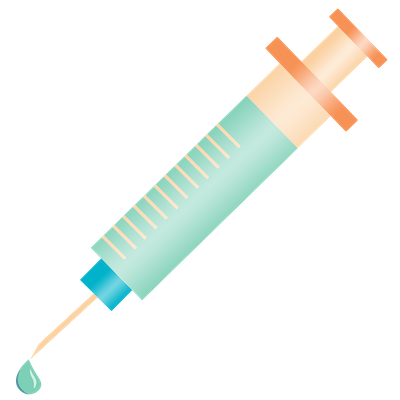
During the summer of 2019, Precise developed a system to take a photo of a pill and use AI and machine learning to identify the pill based on its shape, colors, and any text as part of an innovation project. A basic app was created as a user interface to use this technology without any user research or UX design. This technology was a Top 8 Finalist for an ACT-IAC Igniting Innovation award.
In the summer of 2022, the Innovation Team along with several summer interns undertook a UX redesign of the app and further develop the capabilities of the AI and machine learning features.
Problem Statement
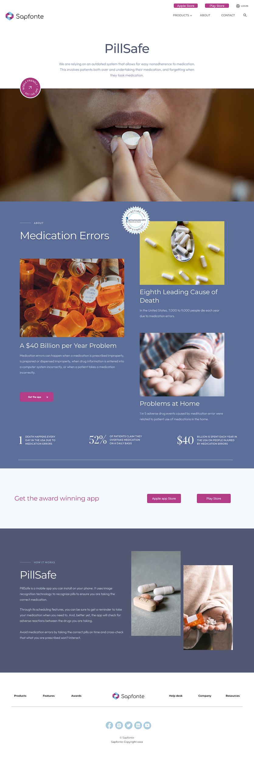
Medication error is the eighth leading cause of death in the US, resulting in 7,000 to 9,000 deaths each year and costing over $40 billion. 52% of people say they overtake medication on a daily basis.
The Goal
Improve the user experience and functionality of the existing basic PillSafe app so that users can identify pills, check for interactions, and schedule reminders on when to take medication.
The Team
The team consisted of 15 members, 10 were fulltime Precise employees, and 5 were summer interns. Precise team members included the VP of Engineering, the Chief Technical Officer, a senior developer, a project manager/BA, and a UX designer.
My Role
I worked as the solo UX designer and graphic designer on the project.
Original Prototype
02
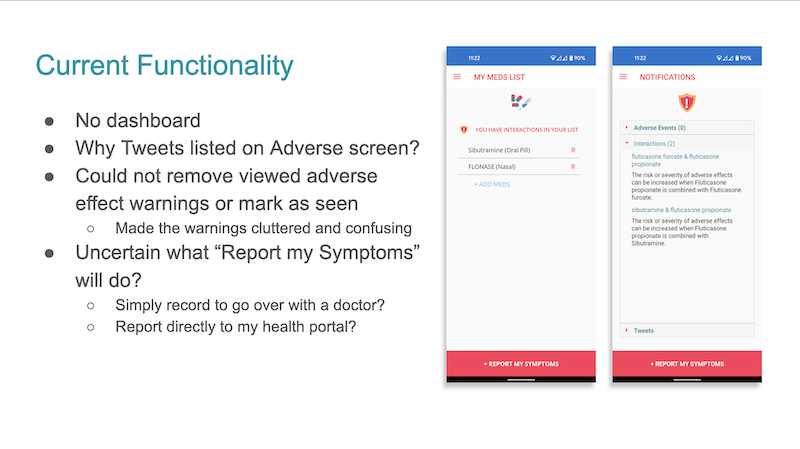
Prototype Review
My first step in the UX process was a review of the existing prototype to grasp the work that had been done, access the current UX work such as user research, and to make recommendations for changes and improvements.
Prototype Review
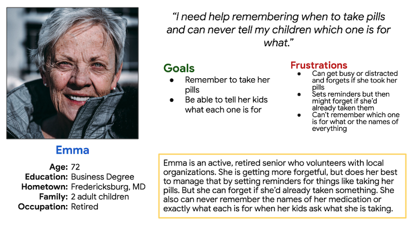
Personas
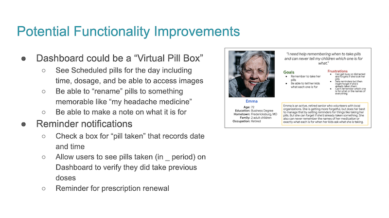
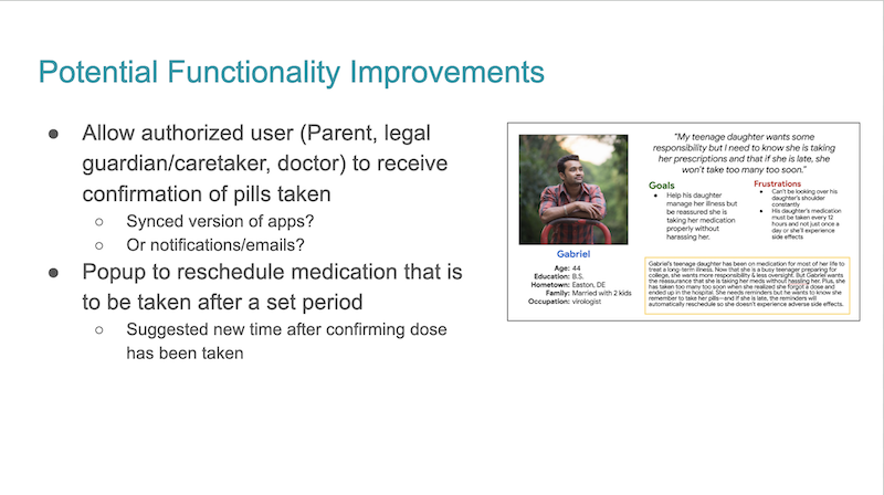
To illustrate potential functionality improvements, two personas were created to represent two diverse types of typical users.

Recommendations for Improvements
03
Ideating
With the window for the interns so short, we kept the user research simplified, based on group brainstorming and reflection. With the personas updated, we created a potential new user flow while the BA intern completed a competitor analysis.
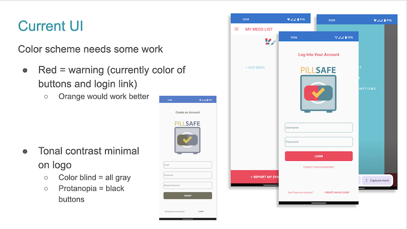
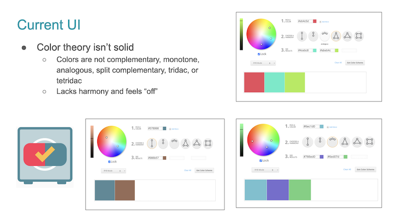
A variety of new color schemes were created using Coolers and we voted on them internally. Once new colors were selected, we created five potential new logos and voted on them for a favorite.
New User Flow
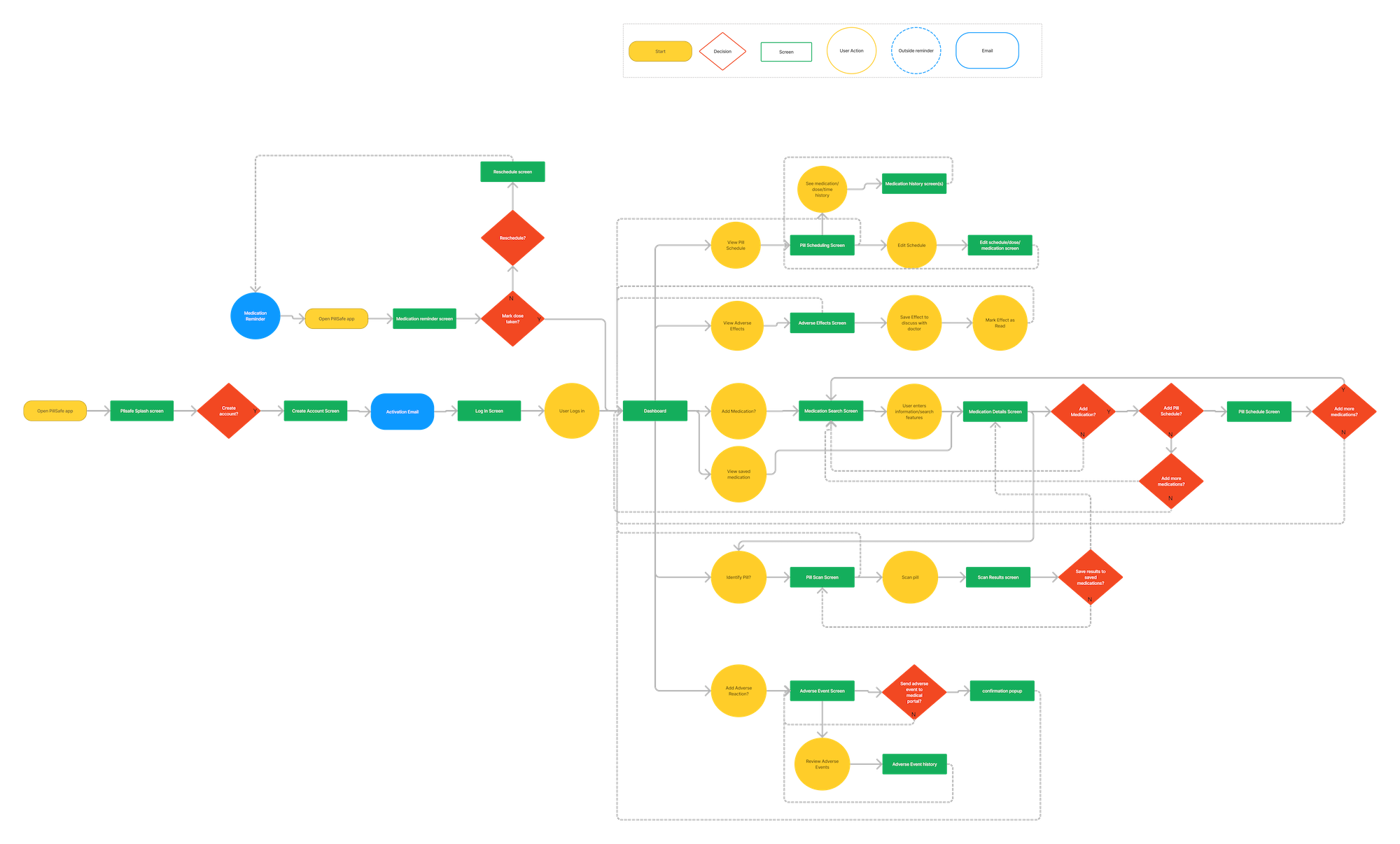
The user flow helped map out how different features were connected to each other and how new featured could be integrated into the app.
Competitor Analysis

One of the six competitors that were reviewed.
Color Scheme Vote
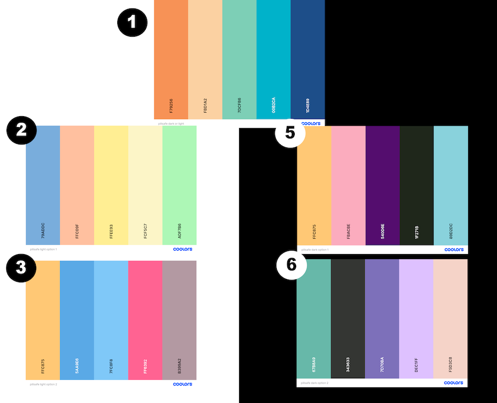
Color schemes for light and dark mode were put to a vote, including one that would work for both. After internal voting, number one was selected as the winner.
Logo Vote
An interest to replace the logo was mentioned early in the re-creation process as it wasn’t very apparent what the logo represented (a very literal pill in a safe), there were no high res assets for it, and it didn’t fit the new color scheme. Five potential new logos were created and put to a vote internally.
The crossed pills and shield won by a wide margin and was selected as the new logo. However, aspects of all of the other images were reused as icons in the redesigned app.
04
Wireframes
With personas, brand colors, and logo decided on, I moved into updating the screens of the prototype app, creating wireframes in Figma after brainstorming dashboard ideas on paper.
Initial Wireframes
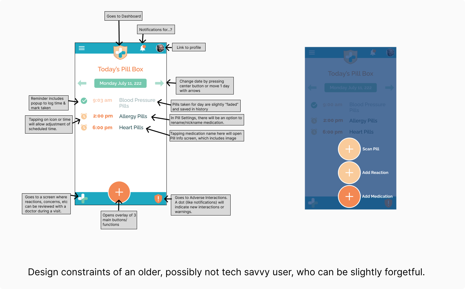
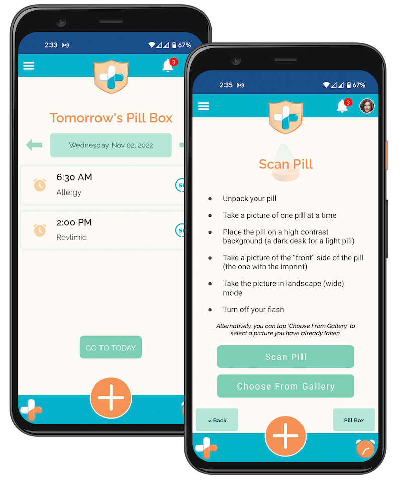
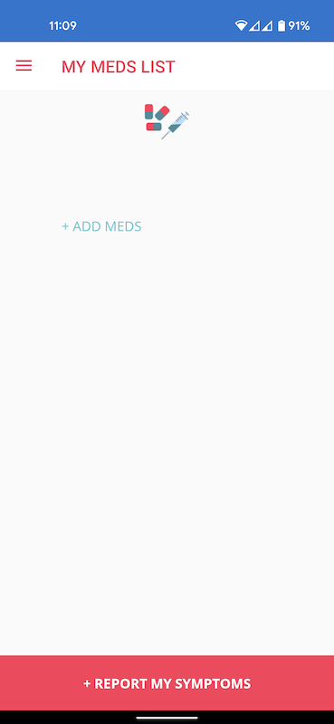
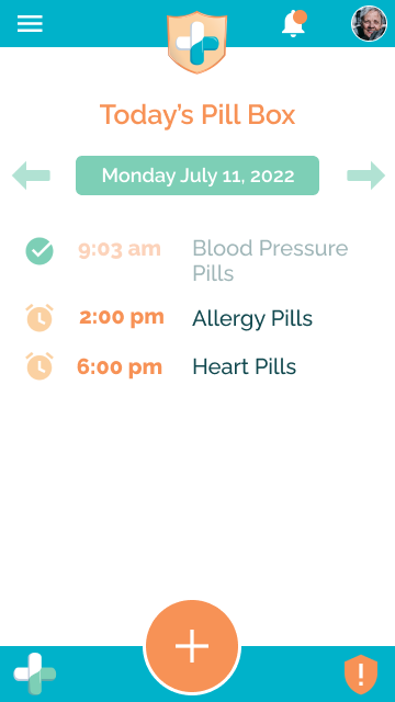
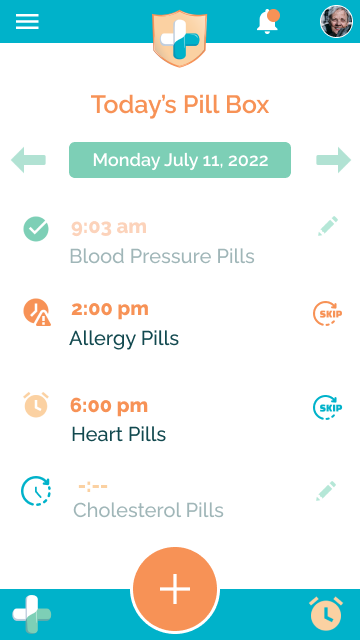
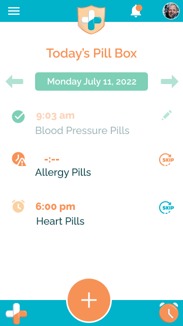
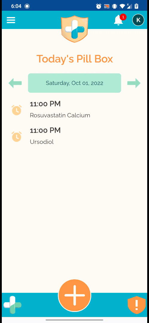
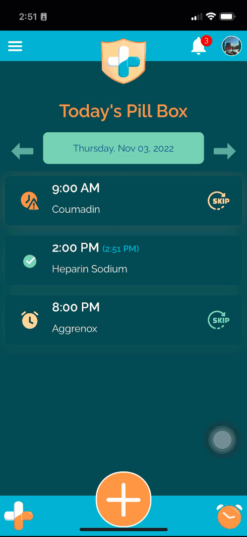
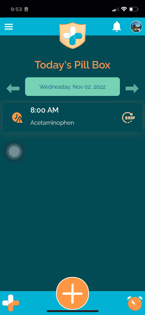
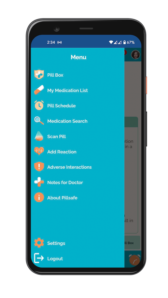
The default user screen (dashboard) was rebranded as a virtual pill box, showing the medication for the day and its status. With three main features we wanted the user to be able to quickly access, a fly out central button was created for the bottom of the screen.
Feedback and Iteration
As we created the screens and discussed the flow internally, suggestions on improvements such as the look, functionality, and importance of the buttons helped us to improve the UX and UI.
Dashboard vs1
Dashboard vs2
Dashboard vs3
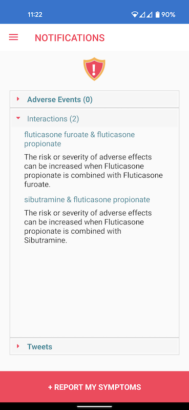
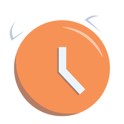
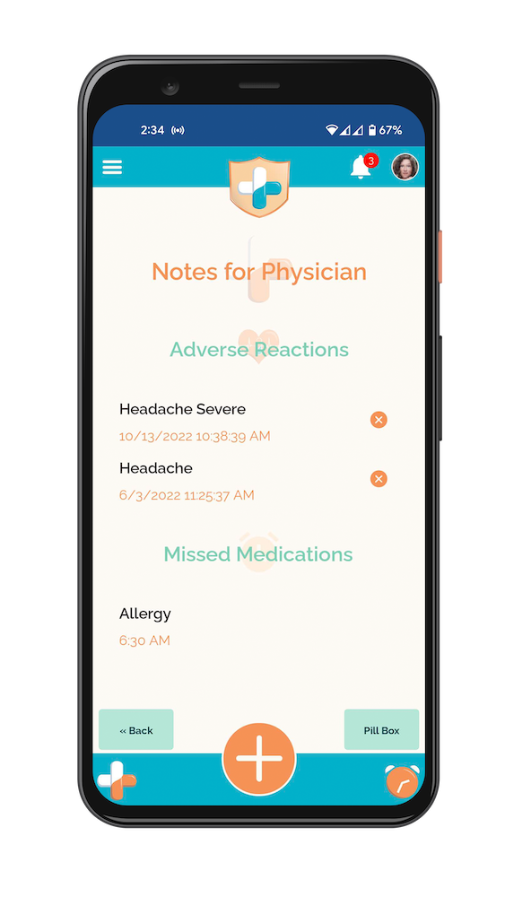
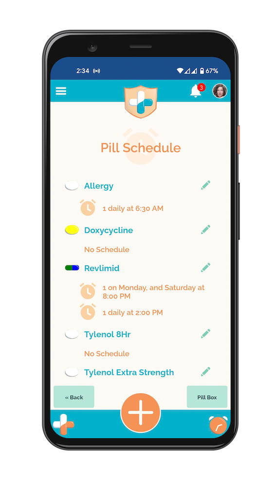
The bottom bar left and right icons/buttons originally went to the Notes for Doctor and Adverse Interaction screens. We kept the Notes for Doctor, but changed the coloring to white/orange to match the other icon. The Adverse Interaction was placed as a notification under the Bell icon (top bar), so a link to the Pill Scheduler screen was placed in the bottom right. In the final version, the hands of the alarm clock worked as an analog time keeper.
Custom Icons
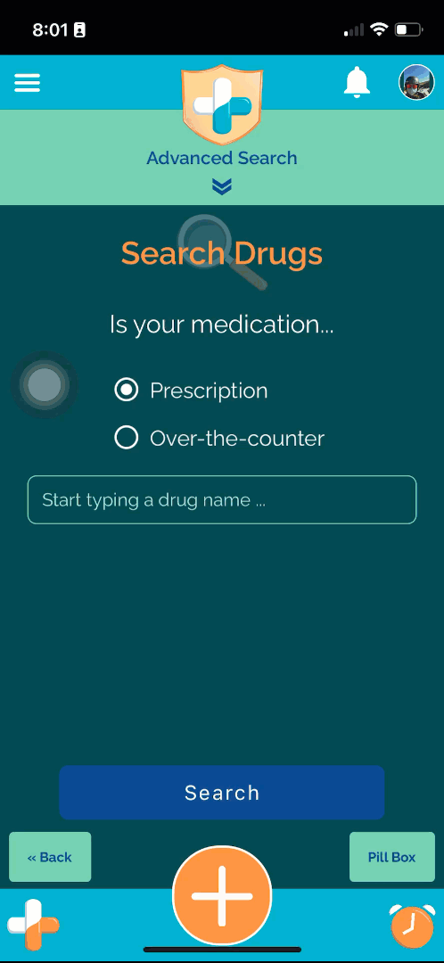
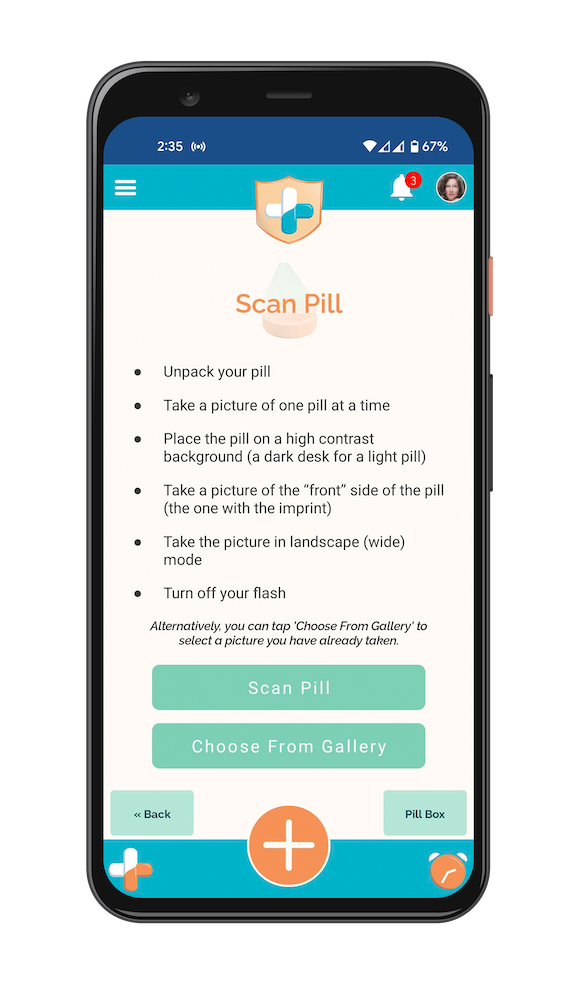
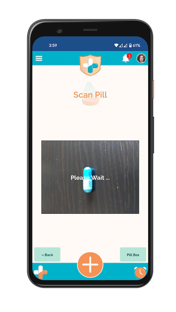
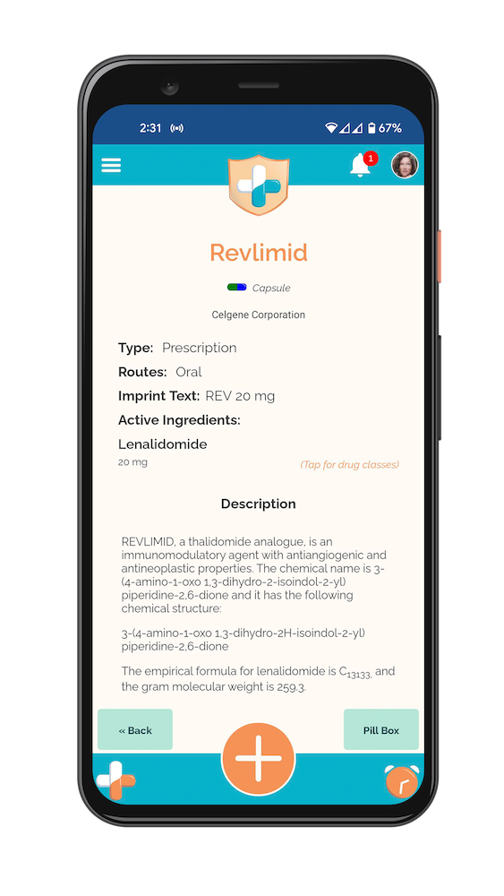
With the flat vector look and feel of the logo, I created custom icons to carry the theme throughout the redesigned app. Additionally, pill shapes were created in chroma key colors that could be coded to mimic the color of specific medication, allowing users to quickly recognize or reject results.


Screen Flows
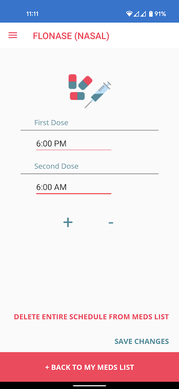
I made screen flows of each of the main functional areas so that the development interns could create the UI.
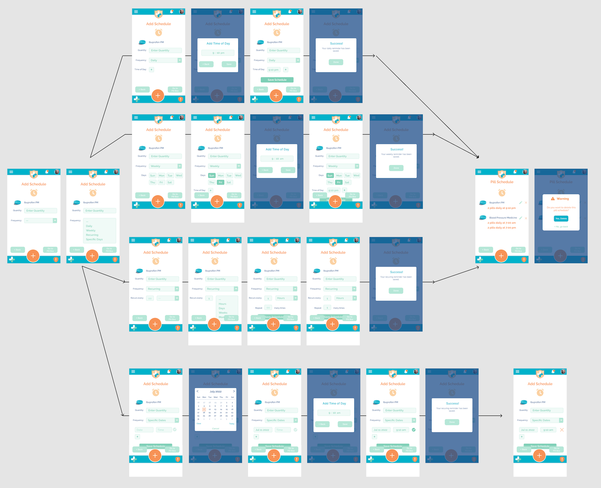
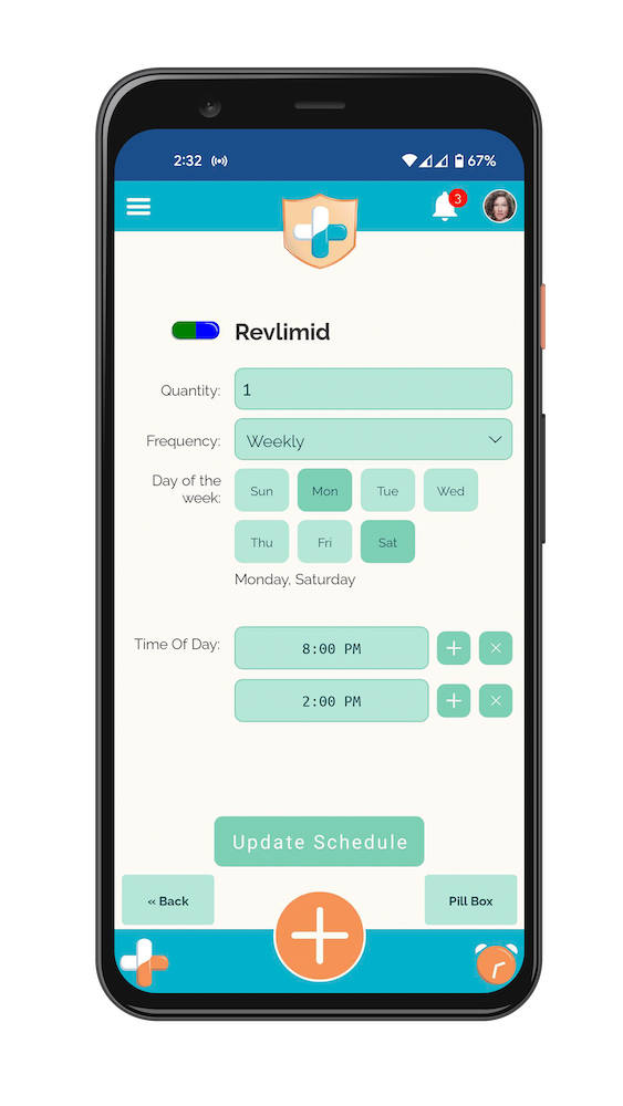
An overview of how the Pill Scheduler should function, including the four types of schedules: daily, weekly, recurring, specific days, and what the confirmation and updated Pill Schedule page would look like.
05
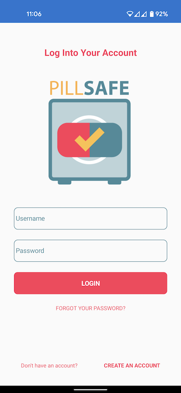
Prototype Update
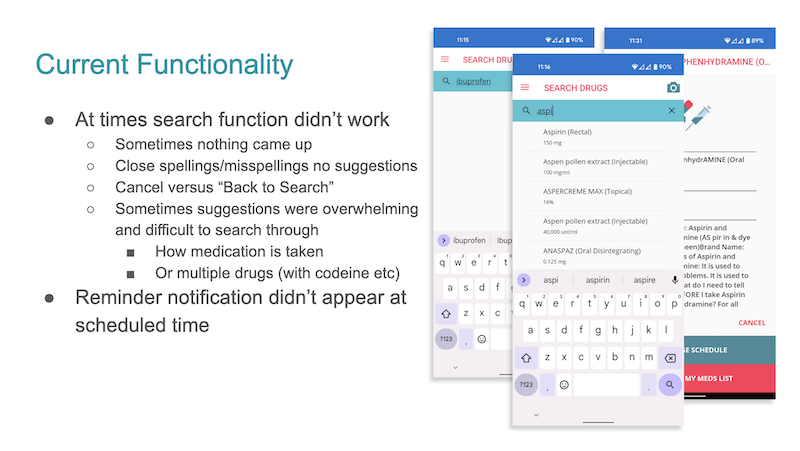
While a few wireframes were wired up in Figma to demonstrate functionality aspects and how Figma worked to the interns, with a limited timeline, we moved directly to developing the old prototype into the new flows and look. Work was also completed on updating the abilities of the feature to scan pills and identify them, making it faster and more accurate.
Using the Pill Box Dashboard
Adverse Interactions in Dark Mode
Advanced Search Features in Dark Mode
Notes for Doctor in Dark Mode
06
User Testing
The app went through two rounds of testing, internally to Precise and then an Alpha test that included extended friends and family in the fall of 2022. There were 12 internal testers and over 20 Alpha testers.
User Feedback and Error Log

07
Marketing Materials
With the app in the final phase of testing before a wide release, marketing materials were created to help promote it to the public. The plan was to launch PillSafe under Precise’s spin-off company, Sapfonte.
Wireframe for PillSafe Landing Page
PillSafe Flyer
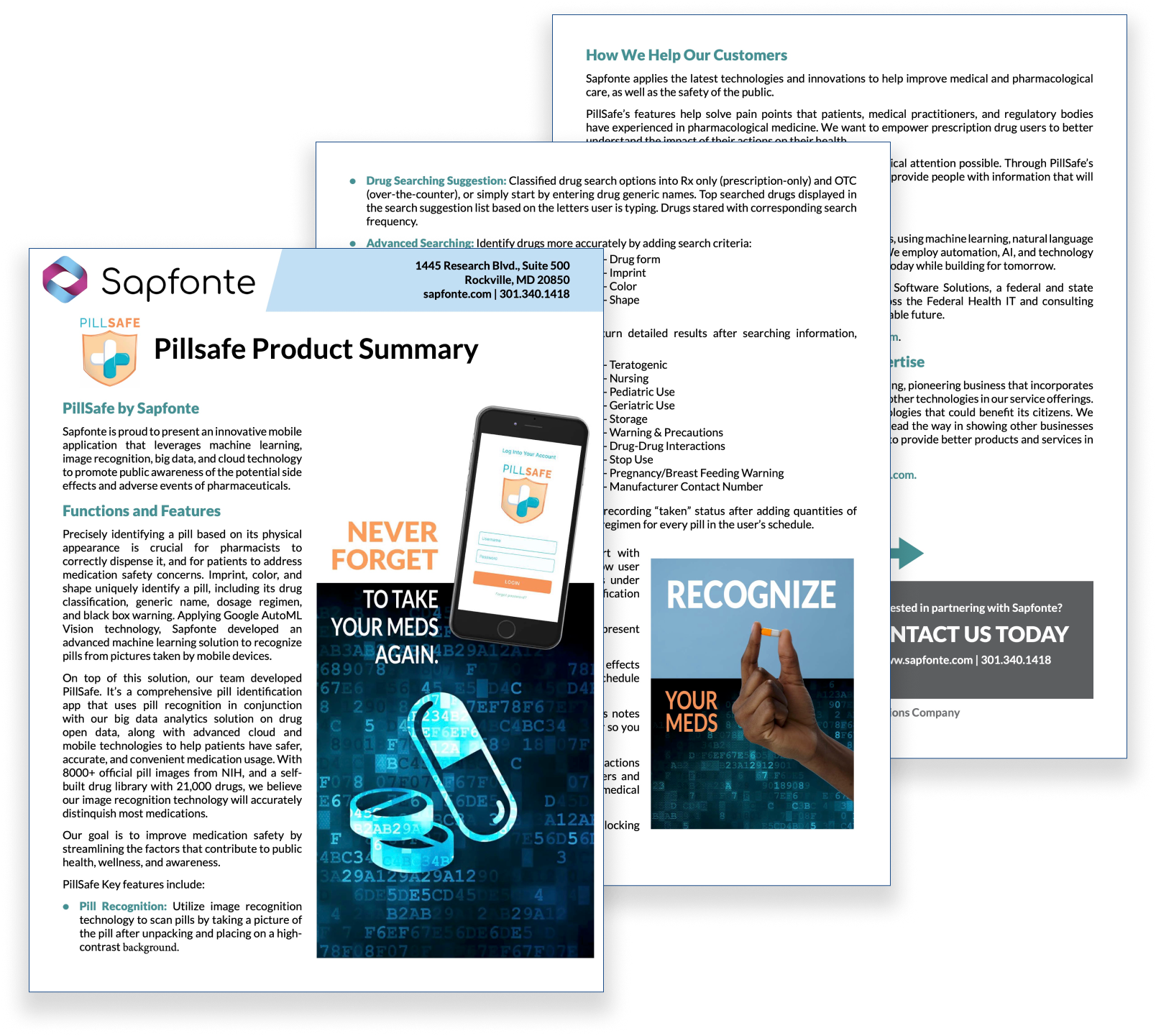
The intern BA, Shen Zhang, wrote the marketing copy with help from the team. I edited it and input it into an InDesign file. I created images based on previously used ones for the original PillSafe prototype with updated colors and fonts.
Download the flyer here.
App Store Images
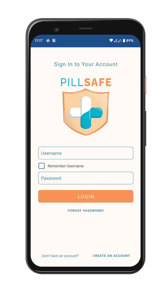
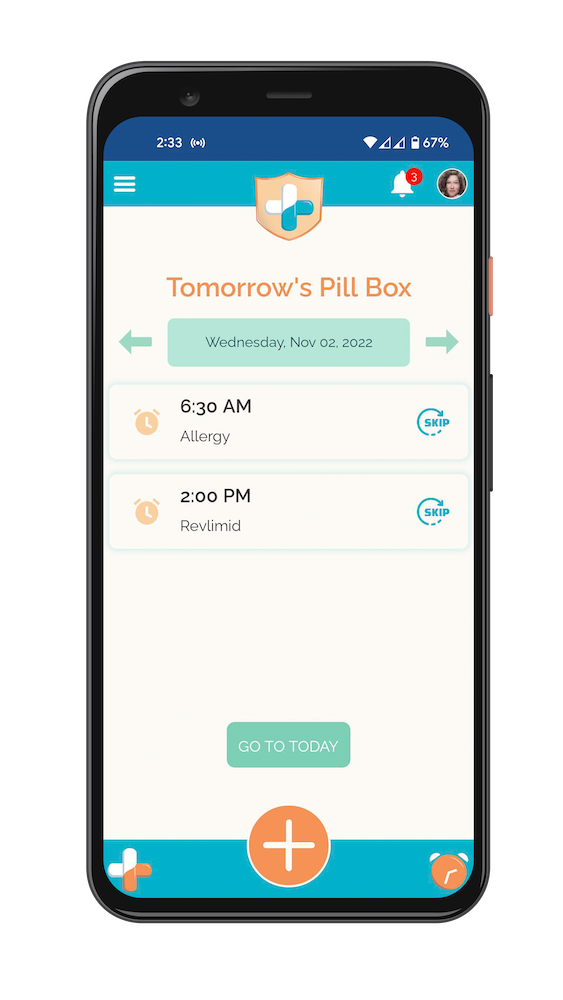

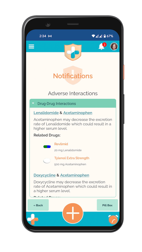
I took screenshots of the app and mocked them up into a phone for use in the Google and Apple app stores. Note the clock on the bottom right works as an analog clock—an easter egg put in by the lead developer. Additionally, notice the pill colors and shapes that match the medication thanks to special chroma keyed pill graphics that could be updated by the code base to help users identify pills.
Marketing Video
Intern Shen Zhang wrote a script and created a marketing video in Canva for use on YouTube. It was never completed at the time. However, I recently used the script to record narration and added it to the Canva video.
08
Next Steps
In the fall of 2022, all the pieces were in place for a release of the PillSafe app. Due to the type of data that would be accessible in the app, lawyers were consulted to help draft the user agreement for using the app. During this, it became clear that the legality of using the app was more than Sapfonte/Precise could handle. At this point, the completed app is being shopped around to companies likely to have an interest in purchasing and releasing it.
09
Lessons Learned
While I understood the abbreviated time frame necessitated concetions on how much we could do, I feel like the app could have been significantly improved for users if we’d taken the time to interview a few potential users to look for their pain points and needs. I was brought in just as the interns were starting if I’d had a few weeks lead time, could have taken care of a some additional steps like user interviews prior to the rush.
Some of the late feedback from users were that there were so many features to the app that it could be confusing. User testing in the prototype stage would have helped iron out some of the complicated flows prior to development, but due to the timeline, development happened immediately after screens were created. It wasn’t ideal.
However, all that being said, I absolutely love this app. It needs some smoothing out, but the features are useful, the pill scan feature is award winning, the interaction warning is eye opening, and the lead developer went above and beyond with his easter eggs like the analog clock icon and working with me to create a chroma key icon he could use to match pill colors for results and searches on the fly—creating one for each pill shape.
Plus, I loved the group dynamic of voting for logos and colors. Despite being the solo UX and graphic designer on the team, everyone offered feedback. PillSafe is a group effort and really was a fanstic project to work on.